Email marketing remains a powerful tool for businesses to connect with their audience.
However, in a sea of overflowing inboxes, standing out requires more than just compelling content—it requires an eye-catching design that captures attention and drives engagement.
So, what makes a good email marketing design? Let’s take a look at what goes into creating beautiful email designs and some of the brands getting it right.
Email design examples
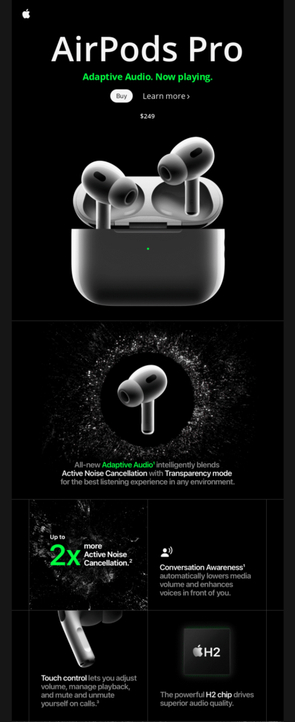
Apple: the king of sleek layouts
A cluttered design or low quality graphics can overwhelm your subscribers and deter them from engaging with your email. A clean and organised layout, on the other hand, makes it easy for subscribers to navigate and digest your content, increasing the likelihood that they’ll perform the actions you want them to. Keep it simple with ample white space, clear headings, and a logical flow.
Apple is known for its minimalist design aesthetic, which translates into its email marketing. Their emails feature clean layouts, concise messaging, and high-quality visuals that highlight the benefit of their products. They also show us how to create a cohesive brand experience across all marketing channels.
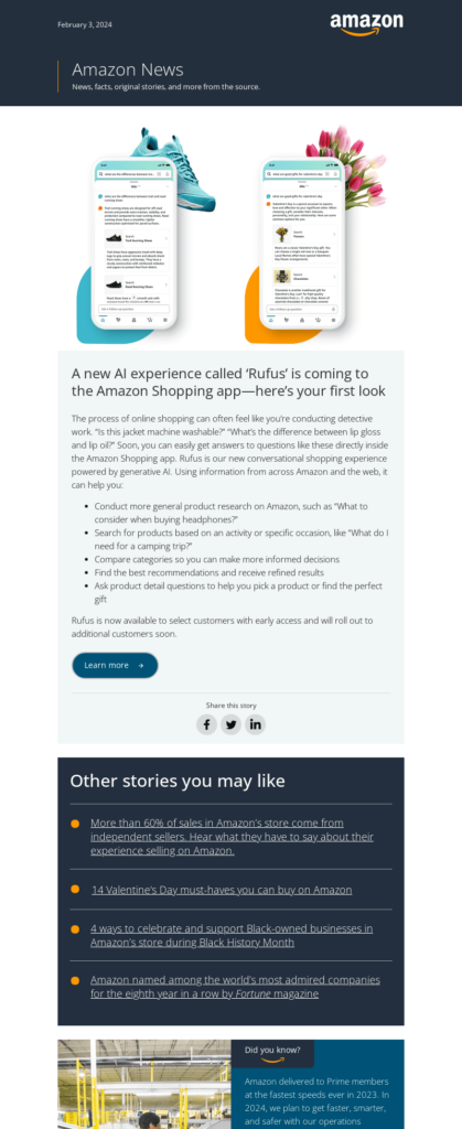
Amazon: embracing mobile commerce
With the majority of emails now opened on mobile devices, it’s crucial to ensure that your designs are optimised for smartphones and tablets. A responsive design adapts to different screen sizes, providing a seamless user experience across devices.
Amazon excels in mobile responsiveness with emails that resize and reformat effortlessly on various devices. Whether viewed on a smartphone or a desktop, their emails maintain clarity and functionality.
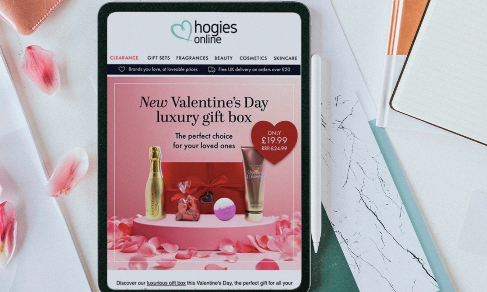
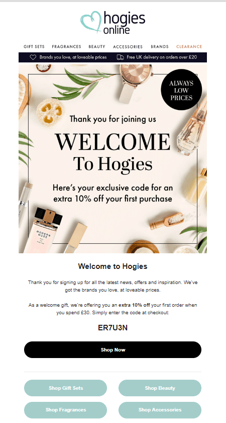
Hogies: making the most of visuals
Visual elements such as images, graphics, and videos can significantly enhance the appeal of your emails and help convey your message more effectively. However, it’s essential to strike the right balance and ensure that visuals complement your content without overwhelming it.
We work with cosmetics retailer Hogies to incorporate eye-catching visuals into every email campaign we design and send, using bold imagery to grab attention and reinforce their brand identity.
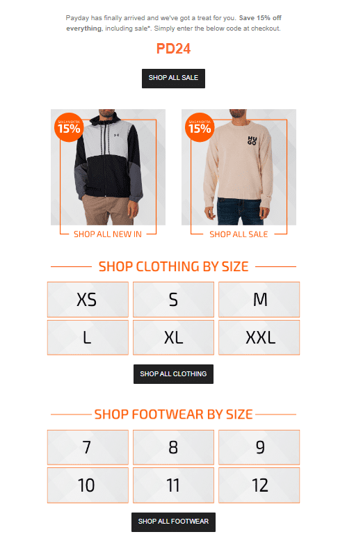
Standout: clear call to actions
A strong and compelling call to action is essential for driving conversions. Make sure your CTA stands out prominently within your email design and clearly communicates the desired action you want recipients to take.
Take our client Standout, for example. During sale periods, we make sure to fully utilise CTAs to make it easier for the recipient to find the products more relevant to them, whether that be by helping them shop by size or by category. Clear and simple CTAs help users find what they’re looking for, increasing the likelihood of a purchase.
Are you marketing emails failing to drive conversions? Our team can help you design emails that combine visual appeal with seamless functionality – send us a message to get started.